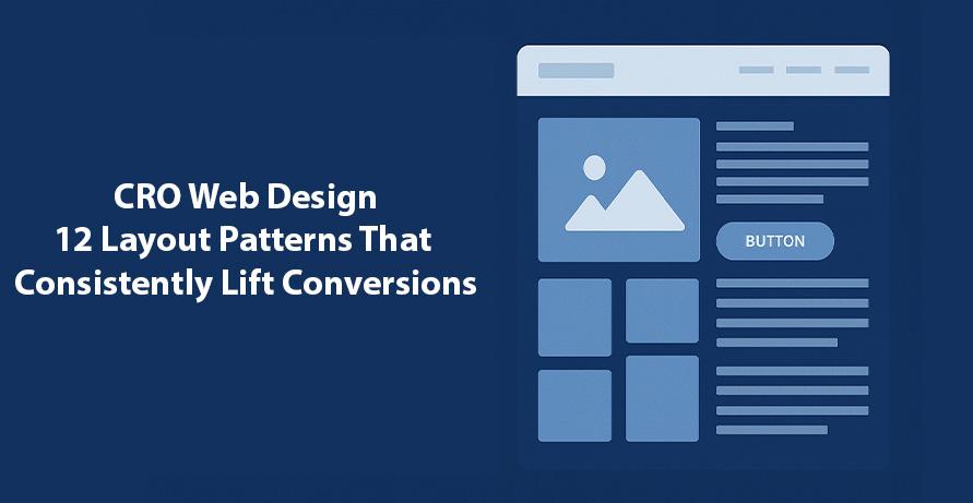
CRO Web Design: 12 Layout Patterns That Consistently Lift Conversions
Web design today is inseparable from business performance. A website is not just a digital brochure, it is often the most powerful revenue driver a company has. The question is not whether your site looks good, but whether it converts. Conversion Rate Optimization (CRO) in web design focuses on how layouts, structures, and interactive elements influence visitor behavior. By following proven design patterns, businesses can reduce bounce rates, guide decision-makers down the funnel, and significantly lift conversions without spending more on advertising. In this blog, we explore twelve CRO web design layout patterns that consistently work, supported by research, real-world examples, and insights into how enterprises can apply them effectively.
Why Layout Patterns Are Central to CRO
Conversion optimization is not about adding flashy visuals or gimmicks. It is about using psychology and usability principles to make a website intuitive, persuasive, and frictionless. Studies have shown that 94% of first impressions are design-related, and that visitors form judgments in less than 0.05 seconds (Stanford Web Credibility Project). Adobe’s 2023 digital experience survey revealed that 38% of users will stop engaging entirely if a site’s layout feels confusing or unattractive. These statistics underscore a simple truth: layout decisions affect revenue.
What makes CRO design so compelling is that it compounds. A 15% improvement in form completion rates or demo requests translates into tangible business growth without increasing paid media spend. For IT leaders and engineering managers, this means CRO web design is one of the highest ROI levers available.
1. The F-Pattern Layout
The F-pattern remains one of the most studied reading behaviors on the web. Users scan a page starting from the top left, moving horizontally, then scanning downward in a vertical line. This means the most critical information and CTAs should be placed along this “F” trajectory. In enterprise websites, we often see F-patterns applied in blog layouts and documentation pages, where users are skimming for relevance. A B2B SaaS firm that restructured its blog to prioritize key headlines and CTAs in the left column saw demo requests rise by 17% within two months.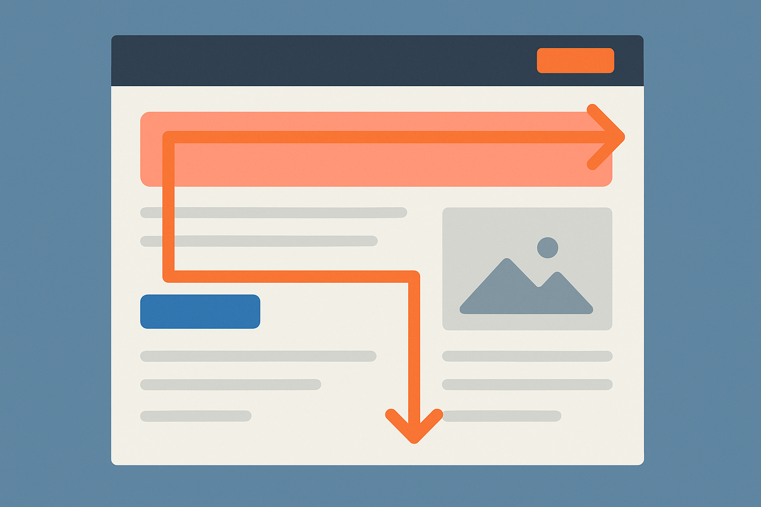
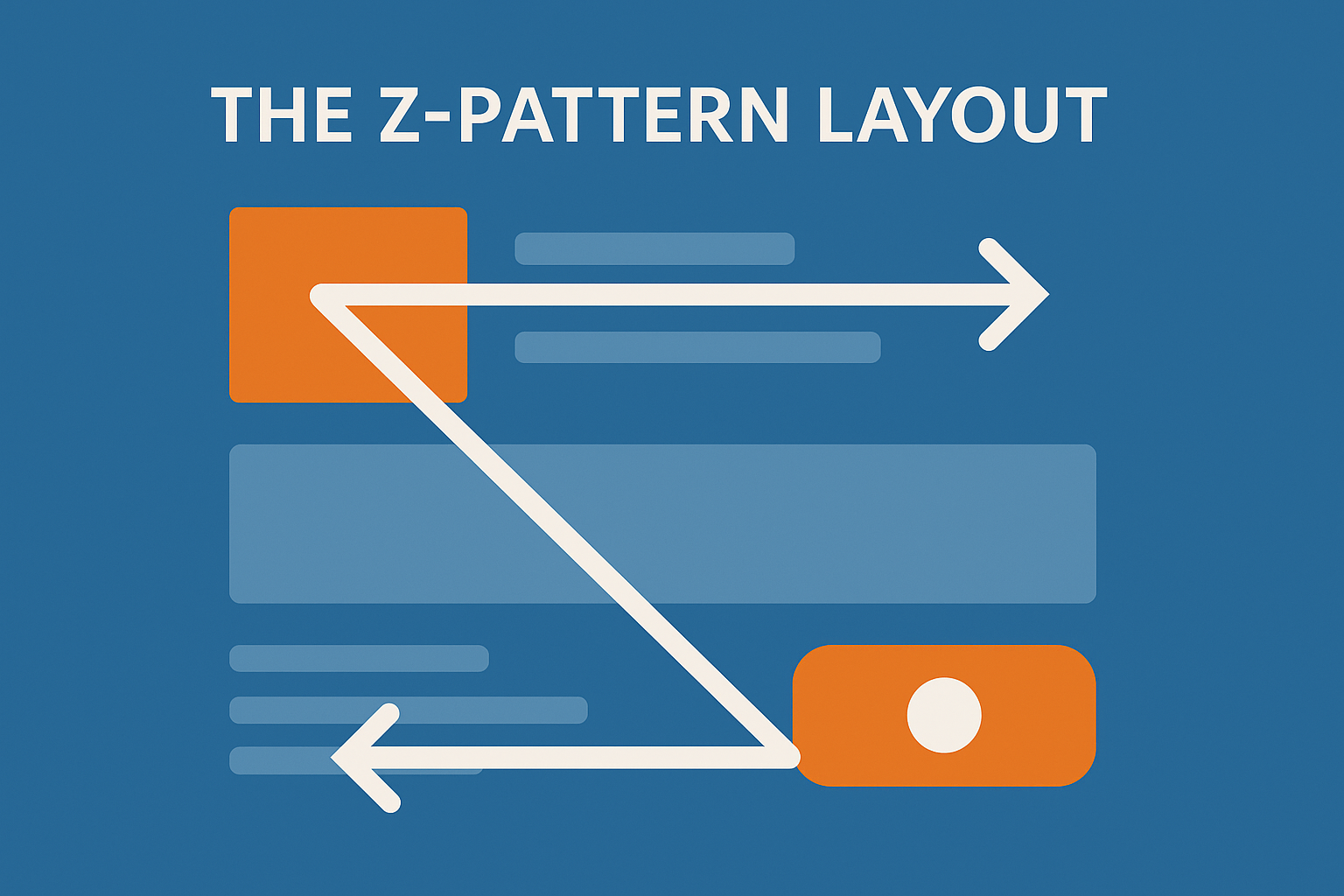
2. The Z-Pattern Layout
Whereas the F-pattern suits content-heavy pages, the Z-pattern is perfect for minimalist landing pages. The eye naturally travels from the top left, diagonally across, then back down to the bottom right, forming a Z. Placing a logo or headline at the top left, supporting visuals in the center, and a CTA button in the bottom right aligns perfectly with this scanning habit. This works especially well for campaign landing pages, where the goal is a single clear action.
3. The Inverted Pyramid
Borrowed from journalism, the inverted pyramid approach puts the most important information at the top, followed by supporting details, and ends with background or context. This is highly effective in B2B service pages, where decision-makers want to see value propositions immediately without scrolling. By leading with the “what you get” before diving into technicalities, enterprises ensure time-pressed executives stay engaged long enough to convert.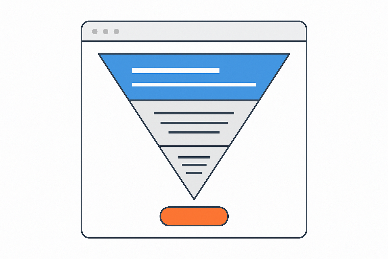
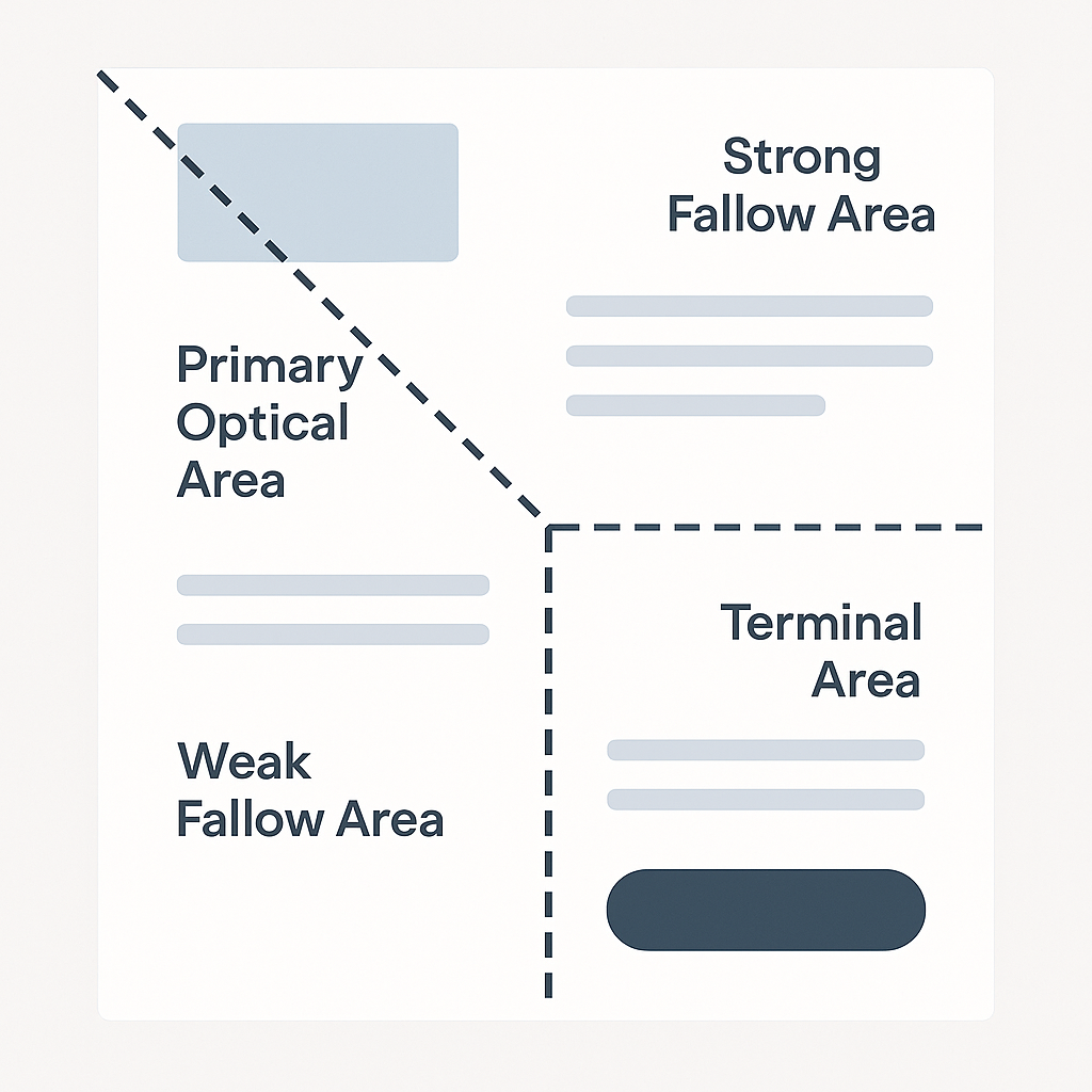
4. The Gutenberg Diagram
The Gutenberg principle divides a page into four quadrants, with the top left (primary optical area) and bottom right (terminal area) being the strongest zones. This means placing introductory value propositions at the top left and positioning a CTA at the bottom right of the visual flow. A fintech provider used this method to redesign its loan application page, moving the “Apply Now” button to the terminal zone. Conversion rates jumped by nearly 20% because users no longer had to hunt for the call-to-action.
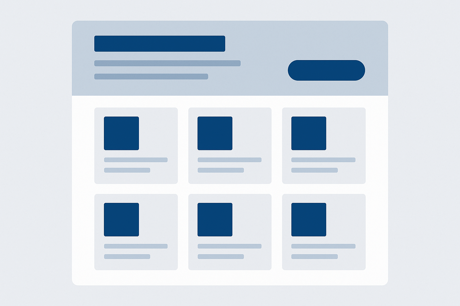
5. Card-Based Grids
Card-based design, popularized by Pinterest and widely adopted by enterprise dashboards, allows complex information to be digested quickly. Each card represents a service, case study, or feature, and users can click for deeper detail. Beyond aesthetics, card-based layouts work because they allow for modular scaling across devices. For example, an IT services company implemented card-based grids for its solutions library, making navigation easier for prospects. The result was longer session duration and improved lead qualification.
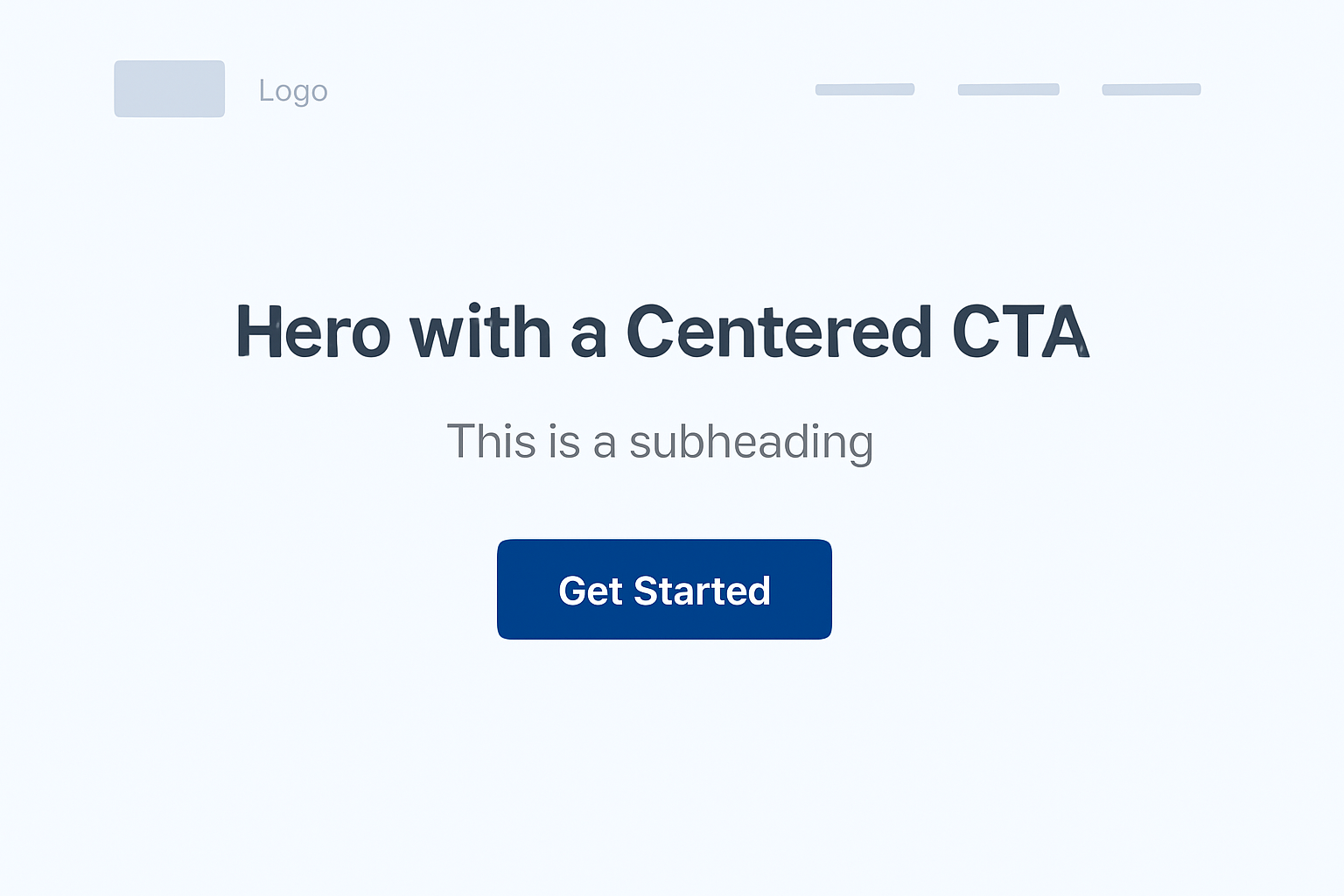
6. Hero with a Centered CTA
The hero section is often the first and sometimes the only area visitors engage with. A clear, centered call-to-action, whether it is “Start Free Trial” or “Book a Consultation,” can significantly reduce cognitive friction. HubSpot’s internal research has shown that simplifying multiple hero CTAs into one primary button can increase conversions by up to 42%. Enterprises offering multiple solutions sometimes struggle here, but the discipline of presenting a single, prioritized action usually yields better ROI.
7. Sticky Navigation and Anchored CTAs
Long pages can frustrate users if CTAs disappear during scrolling. Sticky navigation ensures that as visitors read, they always see a button or link to take the next step. This is particularly effective on long-form sales pages or technical documentation, where decision-makers may scroll through detailed content before acting. A global software vendor used sticky “Request Demo” buttons, leading to a measurable uplift in inbound demo bookings without changing copy or design.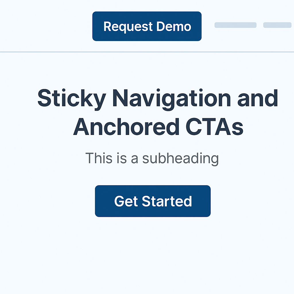
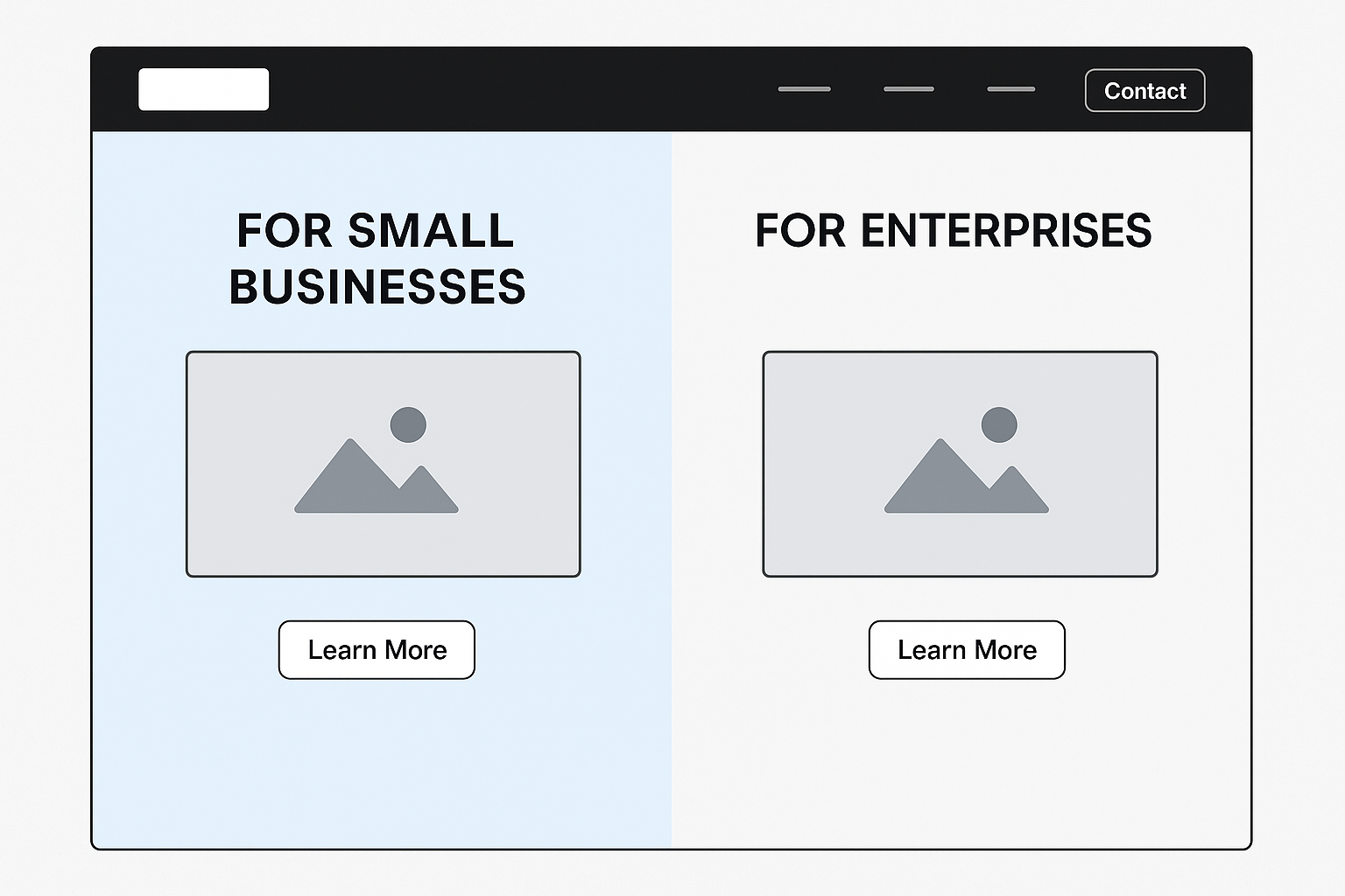
8. Split-Screen Layouts
A split-screen layout divides the page into two equal sections, allowing businesses to compare options or guide users to different pathways. For example, a SaaS company might present “For Small Businesses” on one side and “For Enterprises” on the other. E-commerce brands often use this to display product categories. Split-screens are highly effective because they give visitors immediate segmentation choices, reducing bounce rates by funneling users into relevant journeys faster.
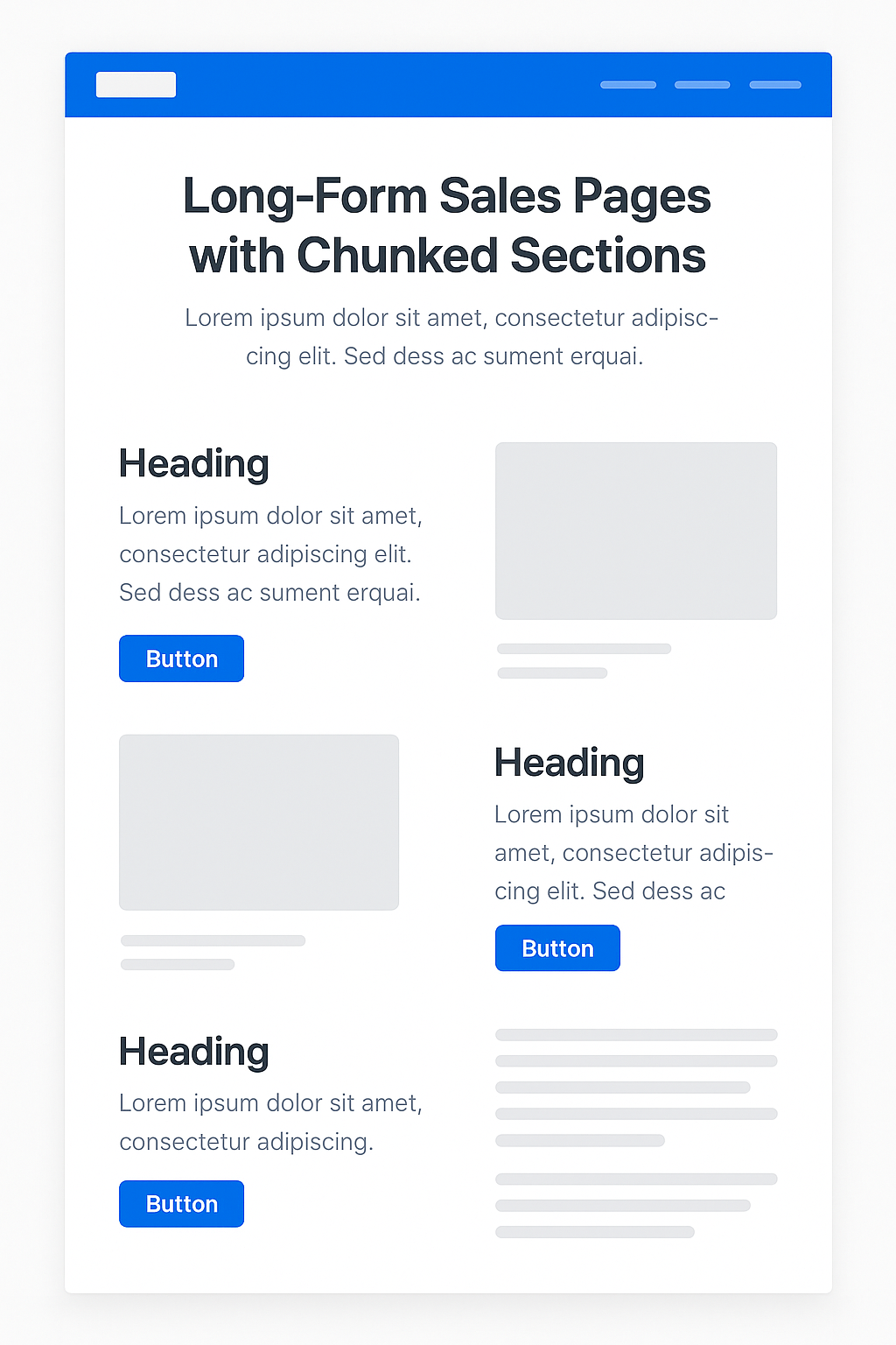
9. Long-Form Sales Pages with Chunked Sections
Enterprises selling complex or high-ticket solutions often need more than a single screen to persuade. Long-form pages can be effective when content is broken into digestible sections with alternating visuals and CTAs. These sections typically follow a problem-solution-proof-action rhythm. One SaaS firm structured its enterprise subscription page this way, using customer testimonials, ROI calculators, and demo invites across the scroll. Engagement time doubled, and the conversion rate improved by 23%.
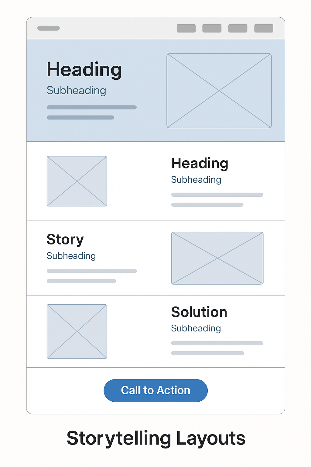
10. Storytelling Layouts
Storytelling layouts walk the visitor through a narrative, combining visuals and text in sequence. They are particularly effective for explaining complex technical solutions to non-technical buyers. For instance, a cybersecurity company used a scrolling narrative that showed the evolution of a data breach and how its solution prevented loss. By contextualizing the problem and demonstrating the solution visually, they improved both comprehension and lead quality.
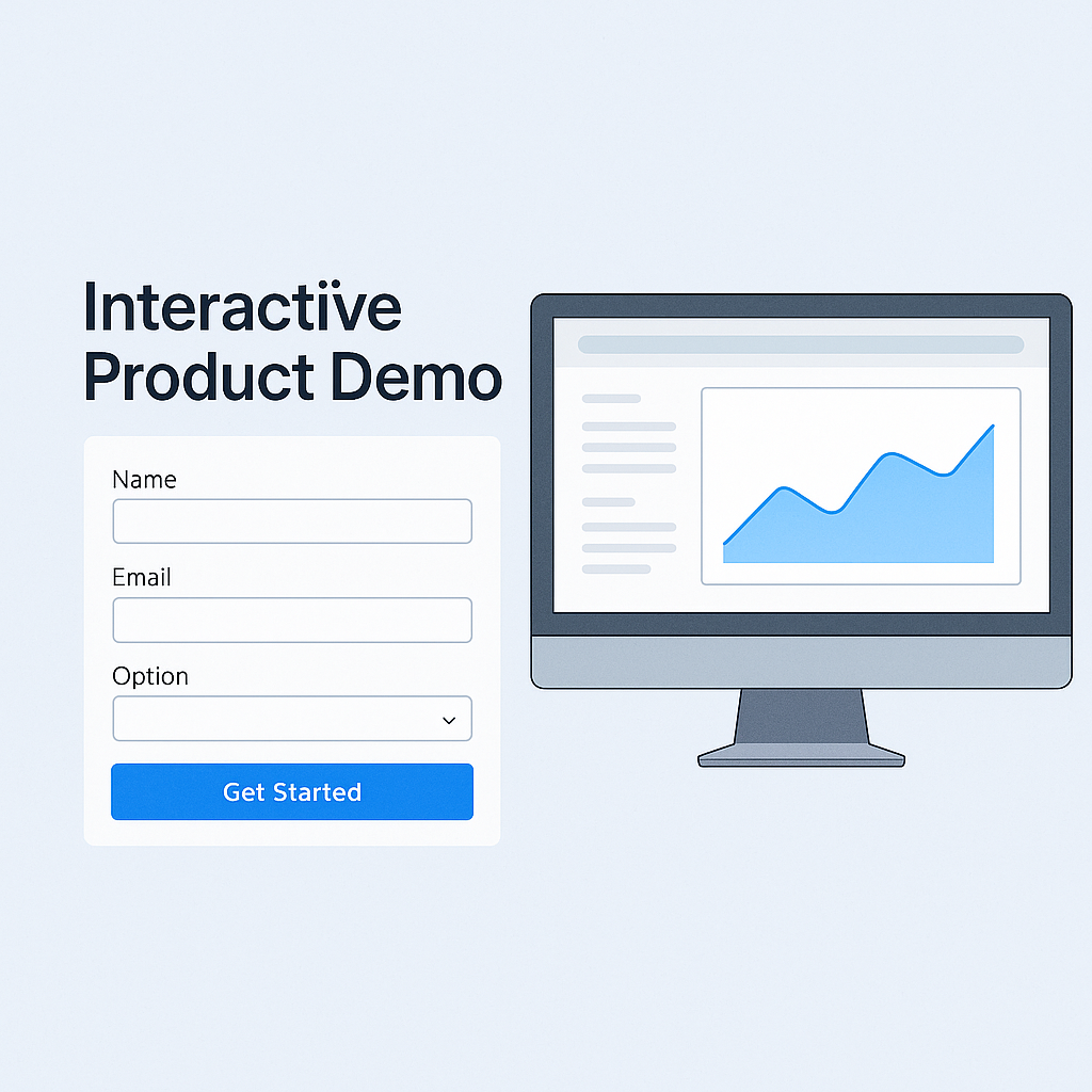
11. Interactive Product Demos
Modern CRO is not just about passive layouts but about interactivity. Embedding calculators, configurators, or quizzes transforms the layout into an engagement engine. A payroll software provider that added an interactive salary tax calculator saw trial signups increase by 28%. Interactivity reduces bounce because users invest time in personalized input, making them more likely to convert.
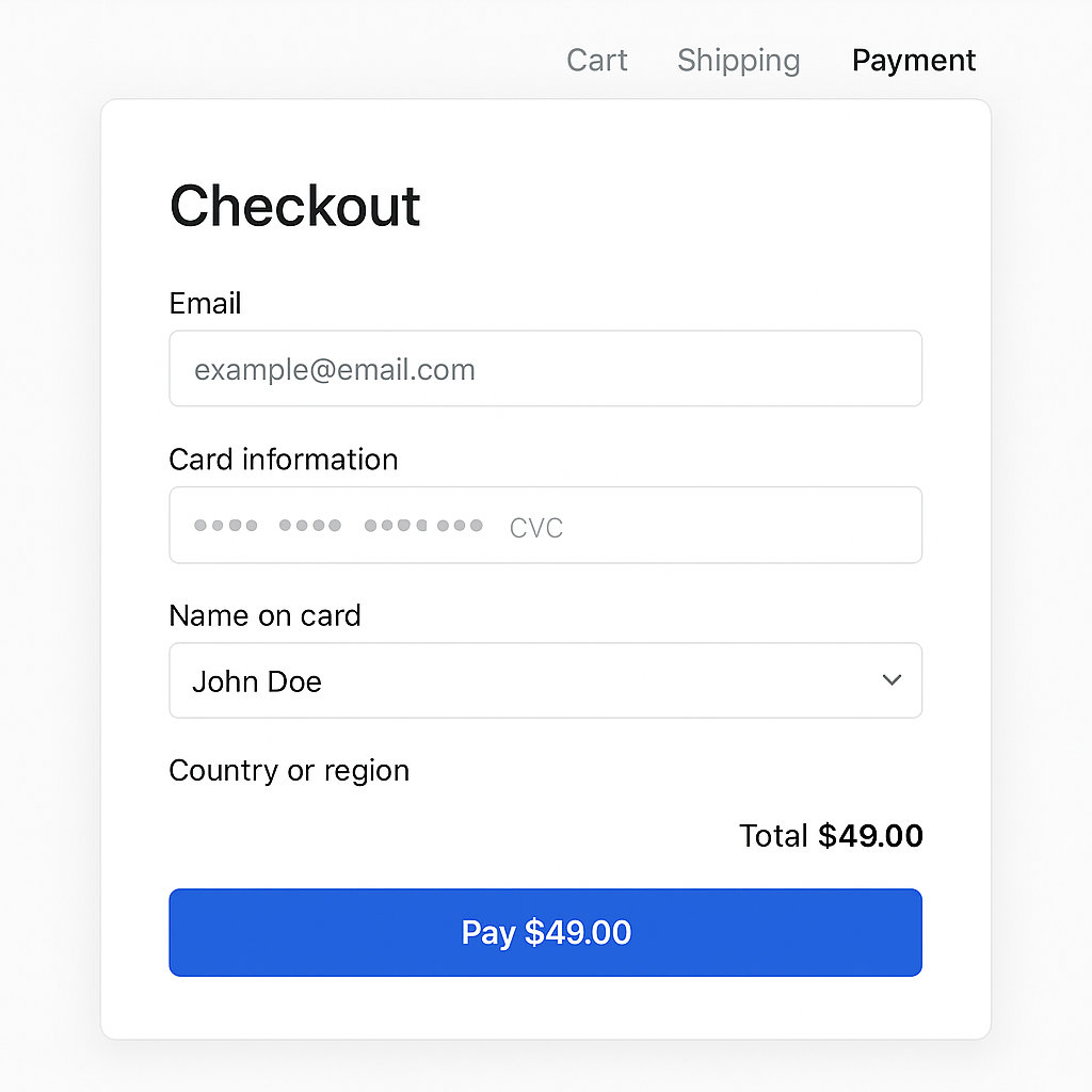
12. Minimalist Checkout Flows
Perhaps the most overlooked CRO design area is checkout or form completion. The Baymard Institute reports that 18% of users abandon carts due to overly complex forms. A minimalist, one-page checkout with autofill and progress indicators reduces abandonment significantly. A global e-retailer simplified its six-step checkout into a single scrolling page and reduced cart abandonment by 21%. For enterprises offering free trials, this translates into frictionless onboarding and more qualified leads.
Trends Reinforcing CRO Layout Effectiveness
Beyond these patterns, several industry shifts are amplifying their importance:
- AI-driven personalization is adjusting layouts in real time, adapting CTAs and headlines to individual users.
- Mobile-first design is non-negotiable, with more than 60% of traffic now on mobile devices (Statista, 2024). CRO patterns must adapt seamlessly to smaller screens.
- Performance optimization matters as much as design. A one-second delay still causes a 7% drop in conversions (Akamai, 2024).
- Accessibility compliance is becoming an enterprise priority. Accessible sites outperform peers not only ethically but financially, with a 12% revenue advantage according to Forrester.
How Anchor Points Helps Enterprises Apply CRO Patterns
While these patterns are proven, execution requires technical depth and strategic alignment. At Anchor Points, web application development and CRO design converge into tailored solutions for enterprises. Teams integrate:
- Custom web application development that embeds CRO patterns into scalable platforms.
- Cloud migration and hosting optimization to ensure layouts load fast, even under traffic spikes.
- Cybersecurity frameworks that protect checkout flows and authentication steps, building trust that directly impacts conversion.
- UX research and testing through heatmaps, A/B experiments, and funnel analytics to validate which design patterns drive ROI for specific audiences.
Enterprises benefit when CRO web design is not treated as a cosmetic redesign but as part of a broader digital transformation strategy.
Final Takeaways
- Proven layout patterns such as the F-pattern, Z-pattern, and inverted pyramid align with human scanning behaviors and should be foundational in CRO design.
- Interactive and simplified layouts, particularly in forms and checkout flows, reduce friction and lift conversion rates significantly.
- Industry shifts around AI personalization, mobile-first expectations, and accessibility make CRO design a business priority, not an afterthought.
- Continuous testing, not static design, is the key to sustaining improvements in conversion over time.
If your enterprise is ready to transform its website into a conversion engine, schedule a CRO assessment with Anchor Points. Our team specializes in applying data-driven web design patterns that maximize ROI.


